In December 2020 I did this webinar with top SaaS user onboarding expert Aaron Krall.
During the webinar, Aaron analyzed the signup process of Villo, a visitor check-in software. Then, I asked him to go through their onboarding email sequence and use it to talk about what a high-converting onboarding email sequence should look like.
Before we move on to the sequence analysis, let’s see what you should take into consideration when you’re creating an onboarding sequence.
4 steps to build an onboarding email sequence
Here are a couple of things that are going to help you as you’re creating your onboarding sequence.
1. What is the outcome you want your users to get during the trial?
In onboarding, there’s a desired result or, in other words, an ideal outcome. It’s impossible to deliver the ideal outcome during the trial. If you could do that, the users would leave after it’s over and never come back.
What you need to do during the trial period is to show them you can deliver on the promise. This means you have to deliver some kind of a meaningful outcome during the trial.
In the case we’re discussing here, Villo (which is a visitor check-in software) is an iPad app.
As Aaron points out, there’s no way that their users are going to be able to see the full capacity of the tool and experience their desired outcome, which in this case might be not paying for a receptionist, better quality health standards, or C-level executives knowing who’s at the front desk.
They might get a taste of that, but they’re not going to see the whole thing.
The trial period is the time for you to really build the value in the tool.
In an ideal world, you would meet with every single person that signs up. You’d ask them what they’re expecting from the tool and what their desired outcome is. And you’d adjust the way you sell your tool based on that.
But if you have a low-touch onboarding process, you just can’t do that. So the next best thing is to decide what are the few things that a customer needs to know in order to see value in the product – and there’s a finite list. You can’t touch on everything.
What you should do next, then, is to identify what are the meaningful outcomes your users want to experience in the trial.
Aaron suggests making a list of maximum 4 different outcomes that they could get during the trial.
In the case of Villo, one of them might be to show how easy it is to use the tool, and another — checking in their first visit.
2. Next, take a look at what the necessary actions to accomplish these outcomes are.
Actions are a series of steps to get to the outcome.
If the onboarding is designed to get users to see these outcomes, you’ll have 6-7 actions that you need them to do in order to reach that specific outcome.
Some of them may not be an action within the tool. It might be a video to show the users what’s possible, a recorded demo, a testimonial, or even some text telling them “hey, this is what’s possible”.
Some of them are going to be actions, but not all of them. In fact, a lot of times having a totally action-based onboarding sequence is prohibitive, because that puts a lot more weight on your users’ shoulders before they see the value.
That’s why a demo is so important, and why it’s the highest-converting sales process. You actually get to tell the salesperson what’s important to you, and then they show you the outcome that you can get. That’s as powerful as you can get.
3. Now’s the time to identify the path of first value.
What’s important to remember at this point is that there are two kinds of value in onboarding: perceived value and experienced value.
Perceived value is when the users actually see what’s possible, e.g. in a demo.
Experienced value is when they actually experience it.
If you combine both of these — show the users the perceived value, but also get them to experience the value — then you have a lot of success.
As Aaron points out, in an onboarding sequence there are 5 types of emails you send out. Some of them are action emails, some are path-of-first-value emails.
The path-of-first-value ones are the actions that they need to take in order to experience the outcome that you promised. It’s the path. You’ve already identified the necessary actions, and now you identify what the path is — what are the steps that need to be taken.
What Aaron suggests to add here is to show additional value, e.g. introduce a feature that the users didn’t yet know existed, or show them that something they didn’t know is possible, actually is.
And then…
4. The activation sequence happens after the users convert.
As Aaron puts it, “when a user converts, they’re on a high. When they press the BUY button, there’s an emotional rush. At that moment, they need help to find out what they bought, what they’re actually going to be able to do. They need your help. Because if they don’t have success with the product, they’re going to churn.”
Onboarding doesn’t stop after the users have converted. In fact, Aaron argues, we might say it begins as soon as they put in the credit card.
The activation sequence consists of all the other things that they need to do (or see, or hear) in order to get the most value out of the product.
There are numerous things that can come into play at this point. One of them is challenging the users’ objections.
Or putting out case studies and testimonials.
How many times have you bought something online, and then went back and looked at the testimonials and reviews? It’s called a buyer reassurance.
So what you can do at this point is:
- overcome the objections
- show case studies, testimonials
- provide more value by introducing the customer to things within the product that they probably haven’t seen yet, and that you know they need to see in order to be successful
That sums up the process.
Now let’s move on to the emails.
Onboarding email sequence in SaaS – analysis of real-life examples
If we take a look at the whole onboarding process, emails are just a small part of it.
What’s really important is the strategy, and what the messaging that you’re putting out is.
Once you have all that in place, learning to write a good email is easy. What’s really powerful around this whole strategy is identifying these 4 things mentioned above, and building the right onboarding sequence.
Let’s assume you have all of this together.
Now let’s see Aaron’s tips on how to make onboarding emails more effective, aka how to get the users to take action.
All of this is based on several onboarding emails from Villo. Mind you, it’s not their whole sequence.
Take it from here, Aaron.
Email sent on day 1
The first one is this:
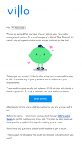
I’m not sure what the subject line is — and subject lines are important.
Usually what we do for the subject lines is we mention a pain. We could say something like “Never X again” or “Get Y really quickly” or “If you’re still using paperwork, check this out”. These are obviously just examples of the top of my head, but you get the gist.
It’s important that you don’t say “It’s time to do X”, because that’s critical. It’s like a critical parent saying “Why haven’t you cleaned your room yet?”.
And our brain is wired to get defensive when we hear sentences like that.
We don’t want critical, we want nurturing. “Have you considered X?”, “I would love for you to Y”, “It’ll make you so much happier if you do this”.
But going back to the email — I love the first two sentences. They’re showing some character and personality, which most companies don’t do.
I love this little lemon guy. I don’t know what it is, but it makes me connect with them.
“To help you get started, I’d like to offer a free one-on-one walkthrough of Villo to answer any of your questions understanding requirements.”
This is actually not bad.
But if you’re trying to get people into a demo, I’d say:
“Rather than spending weeks or hours in the tool trying to figure things out yourself, let’s hop on a quick call, help you get your account set up, and make sure that it’s a right fit for you.”
That approach offers a lot more value. A demo is me showing you everything, while a free account setup sparks a “hey, they’re actually going to help me get set up. It’s going to save me time”.
A demo is adding time to my work day and a free account setup is saving me time — which means the value is inherently greater in the latter case.
“These walkthroughs usually last between 20-30 minutes with plenty of time for questions. To book a time with me, click the button below.”
Instead of this, I’d say:
“We can get your account set up in 20-30 minutes, answer any questions you have and get you on the road to [benefit]”.
One mistake I see here is they’re telling them to take another action, right below the button.
Each of these emails should have one action.
There’s an exception, though — once you get really good at writing emails, you can have another action targeted towards another type of audience. But for now there should just be one thing that they need to do.
If they have to think about what to do — “Should I read the Villo setup guide before I press book a demo? Or should I book a demo now and then go back to the email?” — that’s just too many things to think of.
Get them to do one thing at a time. In this case it’s booking a demo.
What I often do is I add a PS at the end of this email that addresses any objections.
What are the objections they might have to not getting on a demo? It’s time-consuming. It’s going to be boring. I don’t need it. I can figure it out myself.
Address those things in the email — “PS A lot of our customers hop on these calls and they save two to three hours. You can set it up faster and start seeing results faster by hoping on this call”.
Address the objections, as this is what’s preventing them from taking the next step.
Another email sent on day 1
The same thing goes for this email. This is also day one.

There’s way too many things. “Details”, “connect a tablet”, “add your employees”, “safely sign in visitors and employees”, ask questions. And below — “Villo”, “upgrade”, “support”, “unsubscribe”, “privacy statement”, “contact”.
You know how many calls-to-action there are in this email? There’s at least 12. You need to dial it down. What should you do now? What’s the next important thing? It might be connecting the tablet.
“Click this button to download the tablet app. Why should you do that? Because a tablet allows you to do X, Y and Z, and these are the benefits “.
Don’t have so many calls-to-action.
Email sent on day 2
The subject line for this one says “Don’t forget to pair your iPad”, which is a little bit critical.
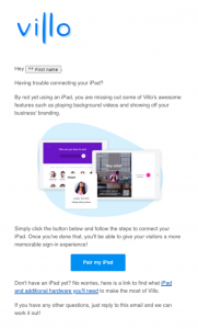
“Let’s help you get your iPad set up”. Isn’t that so much better?
“Having trouble connecting your iPad? By not using an iPad you’re missing some of Villo’s awesome features such as playing background videos and showing off your business’ branding.”
That’s not a good enough reason for me to connect the iPad. There’s got to be a better reason.
Also, “Villo’s awesome features” is a hyperbole. It’s cliche. I’ve no idea what awesome features are.
But if you said:
“When you connect your iPad to Villo, you’ll be able to do… [and then you list three things that are critically important to your customer]”
that would build motivation for them to connect the iPad.
Then there’s a button below.
And here actually is the only option for having two calls-to-action: this is talking to a different audience.
“If you don’t have an iPad yet, find out what additional hardware you’ll need to make the most of Villo”.
You should have it, but have it down below. I would even test it and put it below the signature.
Allright, let’s go to day 3.
Email sent on day 3
The subject line for this one is “Make your first impressions count with Villo”.
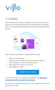
I’d change it to a more customer-focused one.
The user doesn’t want their first impression to count.
The customer doesn’t think at night “I really want first impressions to count”. What they really want is for customers to walk in and be blown away by how professional they look.
Use the words your customers are using.
Next, we have branding features and the button, which is great — it’s just one simple thing.
Again, below they have another article showcasing how Villo can benefit your brand. But why are they sending you to an article? If they’re trying to build value, it should be in the email. It should say:
“And if you’re curious why customizing your branding is important, here’s a few questions we’ve answered for you.
- Why should I customize my branding?
- What impact would it have?
- How do I know it’s going to have an impact on my business?”
Put all that there, don’t send them somewhere else.
And then the “Customize your branding” button should be the only call-to-action.
Email sent on day 4
This is a good one.
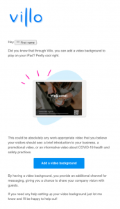
This is one of those things that I would question — is this absolutely necessary for them to get to the desired outcome?
Do I have to add a background video to really see the value of the tool?
If I do, then that’s great.
Still, there are a few things that I would add to this email. One is a quick video to show what it’ll look like with a background video, because I don’t know what a background video is.
When I think of a background video, I think of something that’s going on in the background, not a video that’s going to show a brief introduction of my business or a promotional video.
I really don’t see the value yet, so you have to be really clear with the user:
“Adding a background video will do Z, Y and X. If that’s important to you, add a background video.” And if it’s not important — don’t include it in this email.
Now let’s skip to day 14.
Email sent on day 14
This also is a good one.
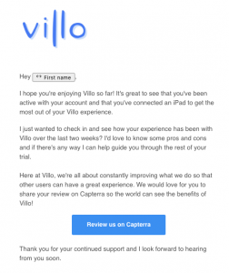
“I just want to see how your experience has been with Villo over the last two weeks? I’d love to know some pros and cons and if there’s any way I can help you guide you through the rest of your trial.”
Well, you wouldn’t want for someone to go to Capterra and leave a negative review.
It’s important to differentiate between trying to get feedback and trying to get a good review. Those are two different things.
Once you identify a customer that you know loves the product, you want to make it really clear and concise. You could e.g. say:
“As one of our top customers, we’d love for you to tell other people about your experience with Villo. As a small company, we depend on customers just like you to help spread the word and help other companies to solve the problem that you solved.”
And then you add the “Review us on Capterra” button.
For feedback, you want to start a conversation.
“Hey, how has your experience with Villo been so far?”. If you have a customer success person, they should be taking that email. Don’t combine the two.
If you combine them, you risk them not doing anything because there’s too many things to think about. Also, you might get a negative review on Capterra — which is fine if you’re OK with it. I wouldn’t make it easy for them to do it, though.
Email sent on day 20
This one’s a trial-ending email.

“Your free trial is coming to an end, so now is the time to make sure you’ve selected the right plan to suit your needs.”
Your customers don’t know what plan they should go with and they shouldn’t have to decide which plan to go with.
You need to either explain it to them — tell them what plan is best for them — or make it so simple that they know exactly what plan is best.
That’s why when it comes to pricing, either usage-based or value-based pricing is usually best.
Usage-based or value-based would mean e.g. that you can check in 3,000 guests a month. Every other feature is included. If you check in 3,000 people a month, you’re covered.
From every month that goes up, you’re only charged on how much you use the product.
That’s quickly becoming the go-to pricing strategy for people because people are tired of paying for what they don’t want.
So for this email I’d say:
“This means you get:
- 1 location
- 1 tablet connection
- Up to 20 employees
- Uploading NDAs to sign
If that’s all you need — great. Sign up here.
But if you’re looking for other things, like delivery management, playing background videos, Slack and Google G-Suite integrations” — and I’d put what it exactly is for each of these points, e.g. Slack integration: so your team can do X, delivery management to Y.
Build value in that higher plan because I don’t know what delivery management means, and I’m not going to go to sign up for it just because you told me it exists.
And then we have:
“If you feel like you need more of Villo’s features…”
I don’t like this because I don’t know what I need. I’m not an expert in the tool that you’re selling me. I don’t know what I should be looking for, I don’t know what I need and what I don’t need.
Your job’s to tell me “Based on what you’ve told us (or what you need), this is the best plan for you”.
I would change this:
“If you have any questions or need help changing a plan reply to this email and I’ll be happy to help!”
This is always the same in these emails. And sure, they might have questions, but if you’re more specific, you’ll actually get them to reply.
You could say: “If you’re still unsure which pricing plan to go with or even if Villo is right for you, hit reply to this email and let’s chat”.
That’s really what they want. They don’t want to help changing the plan at this point, unless they’re already sold on the product — and most people are. If they haven’t converted by day 20, there’s a pretty low chance they’ll convert.
So at this point your goal shouldn’t be to convert, but to get objections out and find out why they haven’t converted yet — at least that’s my strategy.
Another email sent on day 20
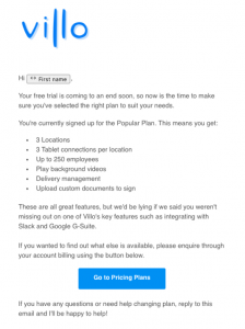
“These are all great features, but we’d be lying if we said you weren’t missing out on one of Villo’s key features such as integrating with Slack and Google G-Suite.”
Again, I don’t like this. What this is saying, is “You have this, but if you want real results, you have to go with our higher plan”.
See how that feels to you?
I think I’m signing up for a tool that’s going to solve my problems and I’m realizing that I’m not even getting everything I need.
This actually happens to me all the time with software.
I’m not saying your ideal customer thinks like that, but just keep in mind that they don’t know how to buy what you’re trying to sell, so you need to either guide them or make it really easy.
“If you want to find out what else is available, please inquire through your account billing using the button below.”
I would change this, e.g.:
“If you’re curious what other options are available to you and what else Villo can do, watch this quick walk-through of our top plan and why most of our customers choose this plan.”
Email sent on day 44
The last email is after the free trial ended and they want to get feedback.
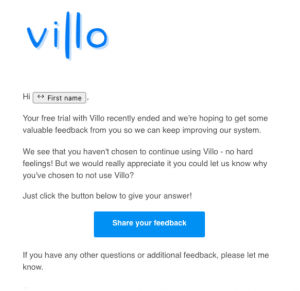
I expect very few responses to this one. There’s no motivation for somebody to fill out the survey. There’s no reward, no value, it’s just using your time.
Chances are, those who fill it out are going to be people who have way more time on their hands than money. Which means you’re going to not only get fewer responses, but you’ll get responses from people who probably aren’t your ideal customers.
At this point you should make it very easy for them to give feedback, or you should build so much value in the “why” that your ideal customer actually responds.
For the beginning, I’d say:
“Hey, your free trial with Villo ended recently. We noticed you didn’t sign up — what did we miss? Where did we go wrong? Could you send me a quick email with your “why”? We’ll use your feedback to help create a better tool”.
That’s why they want to reply, that’s giving them the reason to reply.
***
That’s a wrap from Aaron. Take some of his tips and implement them in your emails, and – specifically – in your strategy.
Why is this article on the Woodpecker blog?
Woodpecker isn’t an onboarding tool — that’s true. But what it can do is boost your trial to paid conversion rate.
As for the results it brings us, I can tell you that on average 30% of all trial signups (which translates into 39% of SQLs) become premium customers of Woodpecker after the free trial.
I think these results aren’t half bad.
Want to see how you can increase your trial conversion, too? Go to this article:
How to Increase your SaaS Trial-to-Paid Conversion with Personalized Email Campaigns>>
