Normally, I write about cold emails but this week is about something completely different. I’m going to tell you the story of our new landing page – have you seen it already? You lose a lot if you haven’t, believe me. Anyway, I hope this story and the 7 things we learned from it will help you in the process of creating landing pages for your own start-up.
***
This post has been first published on 25th Sep 2015, and updated on 18th Feb 2016.
***
In August 2015, we decided we needed a new landing page. A page according to an original project based on an original idea.
“How about the Woodpecker pecking at the sign-up form?” – we were just kidding while brainstorming about the new landing. We wouldn’t have dared to suppose that the ideas from the top of our heads would be actually brought to live.
Our previous landing pages
But let’s start from the beginning. First, I want to show you our very first landings – out of sentiment (plus for a little “before and after” effect.) 🙂
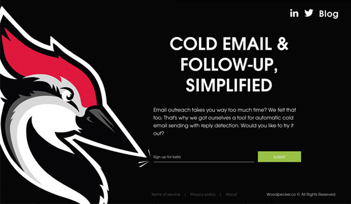
Since we started working on Woodpecker at the beginning of 2015, we had two versions of our landing page for beta.
Both of them were simplistic. Neither of them took us more than an hour to set up (well, excluding the time I spent on the copy…
If you think putting together 3 sentences is easy, you’re probably right. But try to describe your app in 3 sentences to get people signing up for early access. Not so easy, is it?)
Here they are:
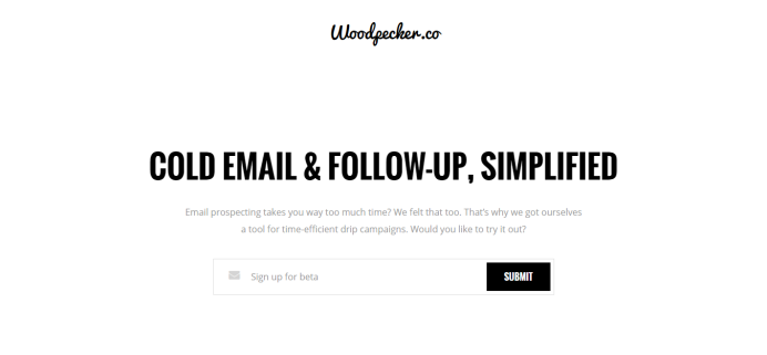
The first version of the page didn’t even include a logo. That’s because we didn’t have a logo at that time. But it made people sign up for the beta anyway (3 sentences, remember! 😉 ).
The second version was also very simple, but in this one we already used our brand new Woodpecker logo.
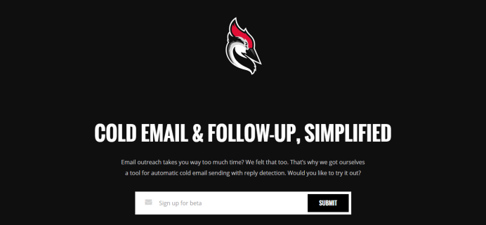
And this was just enough, until we decided we want to put our landing here and there to expose the idea of our start-up some more. We needed an original design to do that. So we thought…
Let’s make a new landing!
When we started the topic of a new landing page, we knew just two things:
- We want the page to be simple, yet powerful.
- We have a powerful logo that we want to expose on the page, obviously.
So, why not use the logo as the main motif on the page and come up with a way to make it even more powerful?
We asked LemonTea to help us out with that. They are a digital marketing agency from Poland and they do awesome websites for organizations in and outside the country. This way, we had more heads to figure out what we want to have on our landing.
The next step was brainstorming on what we could do with the logo to enhance it and make the page memorable to for its viewers.
Let’s make the Woodpecker alive
We figured that we could use our logo as a kind of mascot on the site. We thought, “maybe the Woodpecker’s eye could move? Hey, it could follow some gliding envelopes with his eyes! Wow, it would be totally awesome if its whole head could move, like it was pecking!”
Well, I remember my first realistic thought was: “That’s not gonna happen. It’s too much hardcore design to do. It would be almost like making a cartoon…”
At moments like that, I always think I’m so lucky to have appropriate people around me. At our previous start-up we needed a tool that would send our cold emails for us, we had Maciej (our CTO) to make our whim happen. Now we want an animated Woodpecker – and here’s Kinga saying, “well, I could actually do that”.
The animated design
In the meantime we found out that LemonTea have already done some animated websites, we checked out their previous projects and we loved them – the animation was pretty impressive.
We started talking about what effect could be achieved with our Woodpecker. Finally, we decided to take up the challenge – we wanted to make the Woodpecker alive.
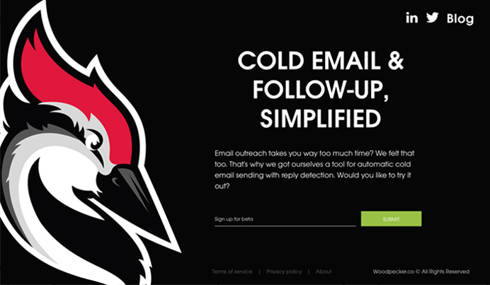
Do you recall how a few paragraphs ago I mentioned that we didn’t take more than an hour to set up our previous landings? Now, this wasn’t the case here.
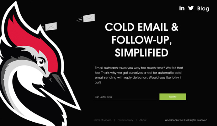
Kinga has actually spent a few days (and one night) to make sure the Woodpecker will move as befits a woodpecker.
And the same time, she was also working on new designs for Woodpecker.co within the app, as we constantly develop new features and improve the existing ones. So there’s no way we can ever forget about the app even for a moment, even if we do totally awesome marketing projects.
I wish I had taken a photo of Kinga the day she was finally done with preparing the animation. That was a rare combination of satisfaction and exhaustion indeed.
Next, we needed to specify all the details with the LemonTea crew, so that the many woodpeckers Kinga had ready on her drive could become one living Woodpecker on our site.

And Kinga really pays attention to details (like eyebrows lifted a bit too high, or pupils directed a little bit too low). I’m not just saying this because Kinga is a designer and all designers pay attention to details, obviously.
She really can see the smallest things a common mortal wouldn’t be able to notice with the naked eye. And moreover, she makes sure the little things, like the eyebrows and pupils, are taken care of.
So here’s big and juicy “Thank you” to the whole LemonTea team, and especially Łukasz who’s coded the site for us last September: thanks for your patience, open mind and pandering to all our whims. 😉
The effects
After a few weeks of fruitful cooperation, the page was ready.
There were the gliding envelopes. There was the eye blinking and following the envelopes, making sure all the emails reach their addressees at the right time. There was the pecking I thought would be almost impossible to do.
The page was what I had in my mind when I had been imaging the impossible. We had a living Woodpecker on the landing page of our beta. It was lively, it was memorable, it was powerful.
Actually, it was so intriguing that we heard from a growth hacker who signed up for the trial out of curiosity, what the Woodpecker would do once he signed up. So yeah, you gotta be careful with creative web design. 🙂
Another alteration of the site – Jan/Feb 2016
Now we’re getting really close to closing the beta period for Woodpecker. 🙂 A SaaS website ultimately needs more than 3 sentences and 6 links, right? That’s why we’re currently working on the new, fuller version of the site. And we’re still improving it step by step.
A few days ago, we published the new homepage. It still has the animated woodpecker on the top, but no envelopes anymore. But we added much more information, which you can see as you scroll down the page.
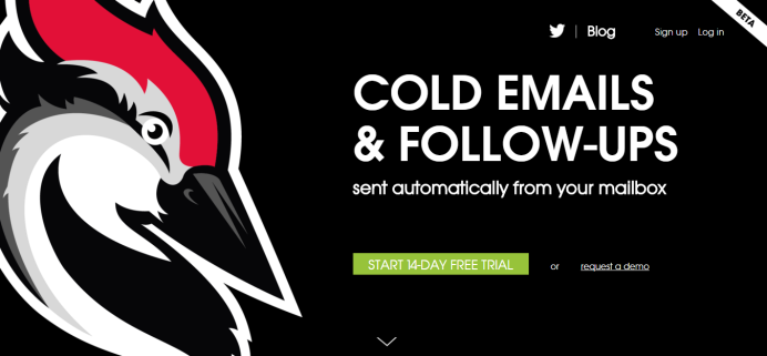
More information without lots of copy
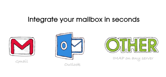
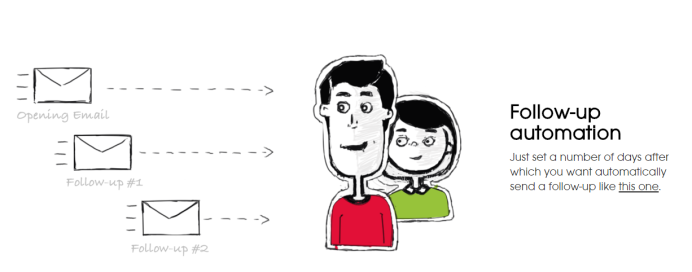
For now, we decided on short descriptions of core features along with little graphics. We wanted the site to be easy to scan through. At the same time, we wanted it to explain our SaaS a little bit. Again, few words – lots of information to convey. Not an easy task for a copywriter.
The homepage also includes some testimonials we’ve got from our clients so far. We believe it’s always good to show that a solution is helpful, not just say that on the website.
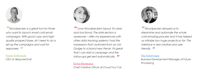
The current version of the page has been prepared in cooperation with Ideas ON – many thanks guys! 😉
This is not the end…
There’s much more information than we previously had on our landing pages. But we’re not finshed yet. There are a few more pages to add, so the site becomes a full presentation of our SaaS. Currently, we’re working on the page “How it works”. Stay tuned to see upcoming alterations. 🙂
If you’re also curious what the Woodpecker looks like alive go to Woodpecker.co and find out.
What’s in it for you?
Ok, so that’s our story, but what’s in it for you? Here’s the 7 things we’ve learned when improving our landing page so far.
1. Start slow – but start anyway.
You don’t wait until your product is perfect before you launch it. And you don’t have to strive for a perfect website from the very beginning. The first site is supposed to check whether you have any potential clients out there – people who are interested with the very idea of your solution. Sure, it’s harder to attract people without a fantactic site.
But if there are people who really have a pain you are trying to solve with your product or service, they will sign up for beta tests after reading just 3 sentences.
2. Use your web design to promote your solution.
At the moment you have a website with an original design, you can promote it on web design galleries and sites promoting start-ups to get some more traffic. Some of the sites allow free submissions, some of them will charge you for featuring your website, but there are enough of them to choose a couple that will fit your needs.
3. Ask a group of friends or a befriended company for help.
Sometimes, when planning a landing page, you get stuck in your own ideas and you get so excited that you can miss some crucial details. That’s why it’s good to have someone outside the business to take a fresh look on your ideas and give you some feedback based on another perspective.
4. Ask current clients for opinion, before you launch.
At the point when you’ve got your copy and designs, you can ask your current clients and testers for opinion. First, ask those who match your ideal customer profile especially well. You want more people matching the profile to become your clients – so if the current clients like the site, there’s higher probability your potential clients will like it as well.
5. Be clear in the headline.
Make sure the visitor knows right away what your solution is. You can use a juicy one liner, or a savvy play on words if you’re Nike, Airbnb, or Slack. In other words, you don’t have to explain what you do if everyone already knows who you are. But initially, nobody knows you. Nobody knows what you offer. And if they don’t know what you do, they can’t even tell if they want to know you or not.
So be pragmatic in the headline. Tell them what can you do for them, so that after 2 seconds from entering your site, they know where they are.
6. Writing the copy, focus on the client.
It’s like in cold emails – everyone likes reading about themselves. Make sure the viewers of your website feel like they read about themselves, even when reading about you. Use more “you” and “your” and make sure you write about benefits when presenting features. I’m still learning that, it’s not easy.
7. Don’t just say you’re awesome, show it.
If you already have some clients, ask them to give you some feedback and use it on your website to show you’re actually solving people’s problems. Lincoln Murphy gives super-useful advice on getting testimonials from your clients without even asking for them. We used advice from this post, check it out.
What do you think?
We already have some positive feedback from our testers and users. But we’d love to find out what you think the new version of our landing page. Feel free to leave a comment here or drop us an email at [email protected].
