Have you ever had an idea to use some special fonts, bold, or underline in your cold email? Have you ever tried including links or pics? Have you been tempted to add attachments to your messages? Here’s about the graphic form of cold emails that work (or don’t work) and the reasons when and why they work (if they do).
If you answered positively to the three questions I posed in the intro, please switch the perspective from the sender to the prospect for a couple seconds and think about that:
- How many times have you actually read, and I mean from start to finish, a cold email that included non-standard fonts, colored, bolded, or underlined pieces of text?
- How many times have you opened links in cold email?
- How many times have you downloaded an attachment from a person you don’t know at all?
Why do we feel tempted to use those things in our cold email?
I think there are several reasons for that, like:
- we may think that bolding pieces of text within our email will make our prospect read those pieces;
- we may suppose that a link to a video presenting how our app works will help our prospect decide if our product is a fit or not;
- we may assume that because the email is so short, an attachment with some educational materials will make our prospects more interested in the details of our offer.
Why should we learn to control the temptation?
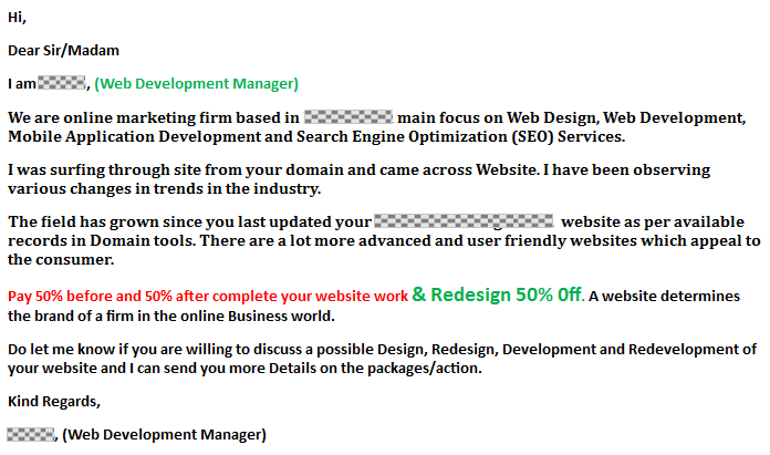
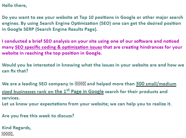
I’m going to use some examples with fonts, to show you most vividly what I’m afraid of. These are the emails I actually got on my mailbox. Please don’t pay too much attention to the copy of the emails below, because it doesn’t make things better. Actually, in most of the cases, it makes things worse.
Here we go. And mind you: the three examples below are NOT what we’re supposed to do. (Note: The chequered fields have been pasted by me on the personal data in those cold emails.)
Pay attention to the variety of font’s types and sizes in this one:

… here’s another one, this time not only colours but also the underline:

… and here goes my favourite one:

So, the questions I ask to myself when I get emails like that are:
Did those people actually know what they were sending out? Did they do that on purpose?
I know those are kind of extreme examples, and you didn’t think about using all the colors of the rainbow in your emails, or 4 different fonts, for that matter. But I think all of us thought about a little bold here and there, or a graphically separated link to our website.
So where’s the line between “too much” and “just right”?
Well, my suggestion about the form of B2B cold emails would be to make them as plain and simple as possible.
When our prospect opens the email, it should feel like an ordinary, personal 1-to-1 message. It shouldn’t feel like a leaflet, or like a newsletter, or even like an offer (although, what we usually send to our prospects usually includes some kind of an offer).
The copy should be short enough, so that the addressee can read the whole email within about 10 seconds. If we feel like we need to bold something to make sure our prospect will notice the piece of information – that’s a sign we should significantly shorten our copy. If the email is personalized, intriguing, concise, and relevant – our prospects won’t mind reading all of it.
And if we decide to add some graphic elements, links or attachments…
we should be able to clearly define the reason why we put them in there. If we plan to add a link to our website, it’s probably better to put it in our signature. If the prospect will be interested in more details they will find the link there, or they will ask us to send them more details (which is a great conversation starter).
If you plan to add the link to a landing page with subscription form for a free trial or demo, first read the previous article on this blog:
Self-Service in Cold Email >>
When to use a link and how?
Don’t get me wrong, it’s not that links never work. The key is to make the link really valuable to the prospect (and no, the link to our website is not that valuable as we may suppose).
When I planned on writing this post, I immediately thought about an example of a cold email included links within the body of the email and it actually brought great results to its author. Bryan Harris in one of his great articles shows step-by-step how to get a $3,000 monthly contract with cold email.
I’m going to embed the screen of the very email here, but make sure you read the whole article because there’s plenty of useful advice and practical tips in there.

As you can see, Bryan used as many as three links in his email. But each of those links plays a crucial role in the message:
- The first one is to prove that he actually works with KissMetrics, and is not just telling he does.
- The second one refers to a post on the prospect’s blog – just so he or she can quickly jump to the content Bryan talks about.
- The third is the link to a demo video he prepared individually for this particular prospect based on the content the prospect previously produced themselves.
Are these three links “too much”? I wouldn’t say they are. They are “just right” because each of them links to a place of material that is relevant and customized for the prospect. It’s not just, “hey I’m, Bryan and I do videos. Here’s the link to my site so you could check what I’m doing.”
It’s highly personalized approach, entirely focused on the prospect. The prospect has no doubt the message was sent to them individually. It is an offer, no doubt about that either. But it’s to-the-point. It tells the prospect “that’s what I can actually do for you”, not “that’s what I basically do for people”.
And that’s how you create cold email campaigns that work. 😉
Check out:
How to Safely Add & Track Links in Woodpecker >>
What’s in it for you?
A few quick points to remember:
#1. Don’t make a Christmas tree of your email. Keep it simple. Avoid leaflet or newsletter style. Make the words alone do the job.
#2. If you feel like some parts of your email should be graphically enhanced, make the email shorter instead.
#3. Don’t include links, pictures, and don’t attach PDF files or other materials if you’re not 100% sure what role they’re supposed to play in your message.
#4. Use the signature to provide your prospect with a link to your website, blog, Twitter, or wherever they will be able to find more info about your company and product.
#5. Don’t let yourself think that the more information you send to the prospect, the more likely they will be to talk to you or sign up for a trial. Instead, try to start a valuable B2B relation by sending them a short and simple email on how exactly your solution could help them and their company.
#6. Make some real effort and show them you actually care. (Tip: Sending them a brochure or a general offer with pricing in a cold email does not show you actually care).
Hope this will help you protect your cold emails from the triumph of form over content. If you have another opinion of the form of cold emails, or links and attachments, based on experience, I’ll be more than happy to read about that in the comments section.
