Why some emails make your readers click immediately, while others don’t?
It’s all in those few words on a CTA button.
Check out a collection of click-worthy CTA examples tailored to fit the specific goals of your emails.
What is a CTA button in an email?
A CTA (Call to Action) button in an email is a clicking element designed to prompt an immediate response. It encourages urgent action from the reader. For example, it can lead a user to visit a web page, sign up for an event, buy a product, or download an eBook.
Call to Action examples that engage the target audience
These CTA examples illustrate the art of creating call-to-action buttons. Each is designed to meet a different goal. Search through the list to get ideas of how to create CTAs to:
- boost sales and promotions
- register more attendees for events
- engage readers to download your ebook
- ask customers to leave feedback
- remind people about your brand
- upsell and cross-sell
Sales and promotions
1. “Unlock your exclusive deal”
With such call-to-action examples, readers feel like VIPs. 71% of customers expect personalized interactions (McKinsey’s & Co.), so pay the most attention to the word “your” here. People love feeling special, and this CTA makes them feel that way.
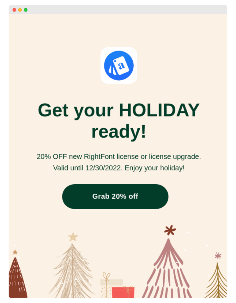
2. “Grab 20% off”
This CTA is like a high-five on a great deal. It’s direct and to the point, ideal for flash sales or special promotions. Place it in an email that creates excitement, like, “Ready for a steal? Grab 20% off today!” It’s a call to action that combines the thrill of saving with the satisfaction of a smart purchase.
3. “Shop the limited-time sale”
It’s an adrenaline rush in button form. That anxiety about missing a great deal drives the desired action and catches the audience’s attention. It plays into the fear of missing out (FOMO) and encourages customers to act quickly. Use it in an email that highlights the offer’s exclusivity and its fleeting nature.
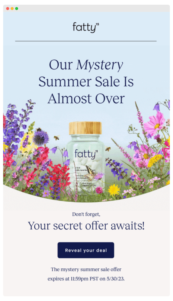
4. “Reveal your deal”
This call-to-action copy is like a gift with your customer’s name on it. It’s great for personalized offers or mystery discounts. Use it in an email that teases the unknown, like, “What’s your deal today?”. It adds an element of fun and curiosity, turning a simple offer into an engaging experience.
5. “Explore our seasonal discounts”
This compelling call to look for discounts is effective during a particular season or time of year. It’s a way to connect with the customer’s current mood and interests. It captures the excitement of finding a good deal. And it’s aligned with the shopper’s mindset and desire to find the best deals during such special sales.
6. “Activate your coupon code”
This direct CTA is particularly effective because it combines the promise of a reward (a coupon code) with a simple call to action. It gives the reader a sense of control and immediate action. The action word “Activate” makes the process feel interactive – as if the reader is unlocking a special benefit.
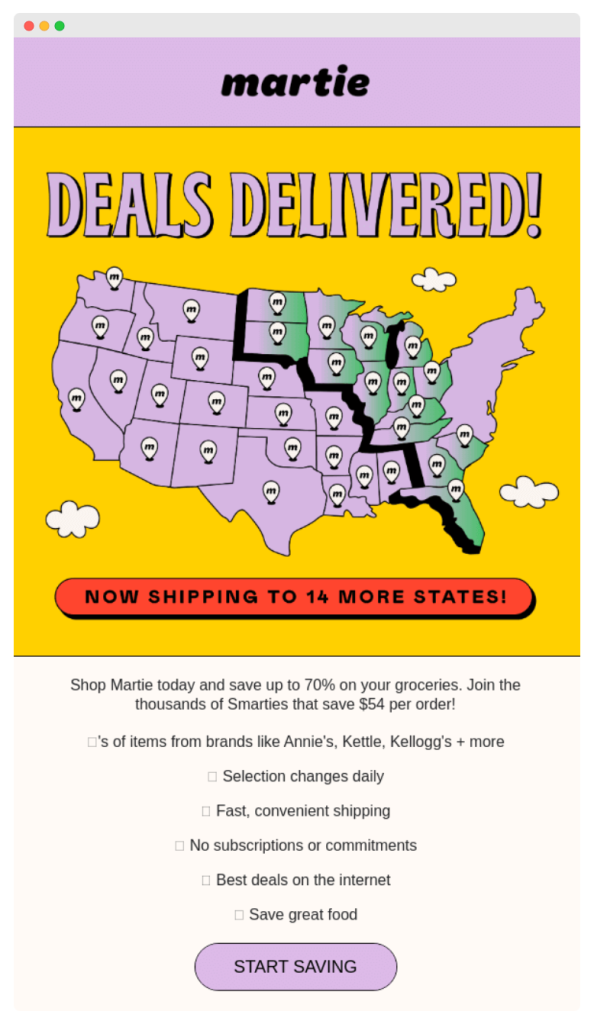
7. “Start saving”
It’s a good call to action button because it shows a clear benefit (savings). Readers won’t want to miss this opportunity, so they click it! It’s a straightforward appeal to the reader’s need to be economical and make smart purchasing decisions.
8. “Find out your mystery discount”
This soft CTA cleverly plays on the natural human curiosity and love for surprises. The phrase “mystery” creates an intriguing sense of the unknown, and it turns the act of clicking into a moment of discovery – almost like a game. It’s a more gentle approach than a direct sales pitch.
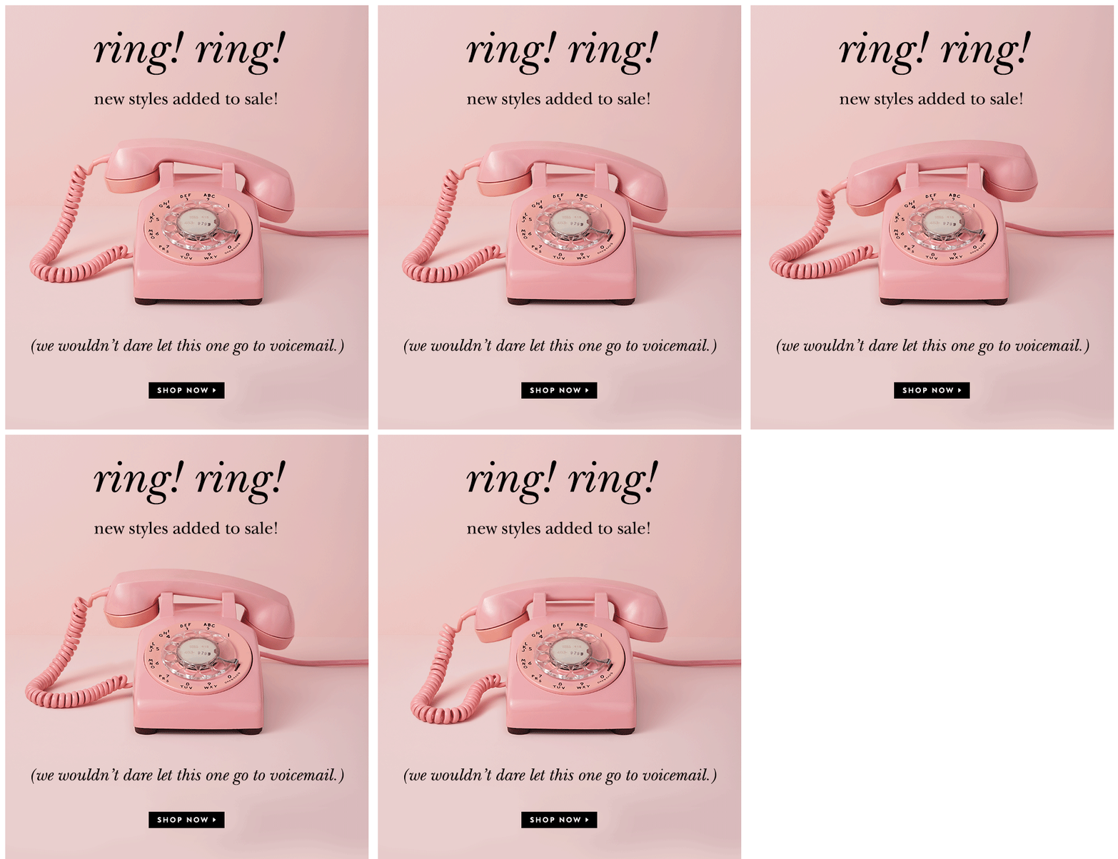
9. “Shop now”
It’s not one of those good CTA examples that will do the trick on its own. But with a suitable copy and graphics around, sometimes even something as simple is enough. Just look at this email, which creates a truly irresistible offer.
10. “Start your journey with us”
This call to action button is an invitation to a long-term, rewarding experience with your brand. It evokes positive emotions by reassuring readers they will be supported throughout their customer journey with you. It emphasizes that their engagement with your brand is more than just a transaction.
Event registration
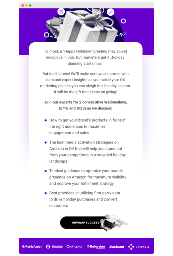
11. “Unwrap success”
Picture this CTA as your secret weapon in an email marketing campaign targeted to business pros. Like in the great example below, the readers have the impression that the invitation is a gift – the event that contains killer strategies to help them boost their marketing efforts.
12. “Reserve your seat today”
Urgency in a copy leads to higher conversion rates and sales. Such CTA examples are a creative way to show the reader they need to hurry up. It’s the best call to action button for events with limited attendance. It makes each spot seem unique and emphasizes the need to act fast to not miss out.
Here are some tips on how to use persuasive methods to craft effective CTA buttons: Perfect CTA, or How to Write a Persuasive Cold Email?
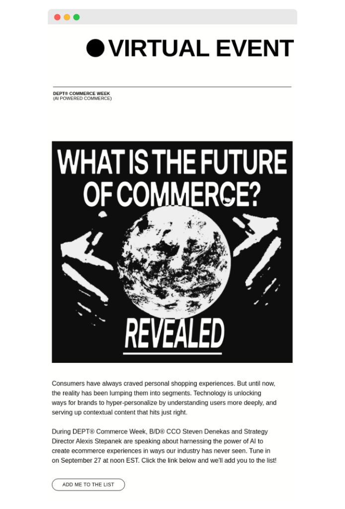
13. “Add me to the list”
This CTA language is informal and personal at once and makes the reader feel that they’re joining an exclusive club. Use such CTA for unique events, and highlight what being on ‘the list’ means – like insider information during the event.
14. “Be part of the event”
Today’s customers want to be a part of the brand’s story, not passive followers. When customers encounter this kind of action-oriented language, they feel invited to participate in something they can make a difference in.
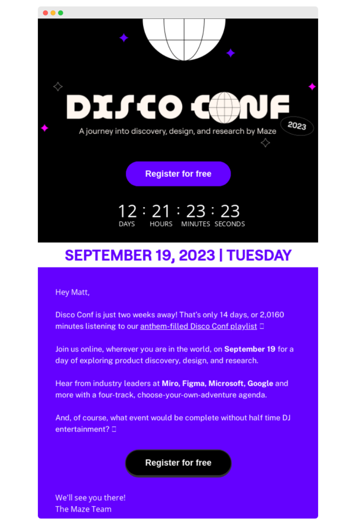
15. “Register for free”
If you decide on a simple CTA button (it still can be super effective), you need to put a lot of effort into the rest of the email copy. Let’s look at how Maze did it. They put a real-time countdown timer, which made the recipient feel pressed for time. Also, they personalized the copy as much as possible.
✅ Woodpecker Expert tip: What about two CTAs in one email? According to the cold emailing laws, emails with 2+ CTAs perform worse than emails with no CTA at all. So, be careful with using a second CTA in your copy.
16. “Secure your spot now”
These action words let your customers know right away that seats for this event are flying off the shelves. Think of those buzzing concerts or exclusive workshops where everyone wants to be. It’s a great call to action to generate excitement and make clear that waiting is not an option here.
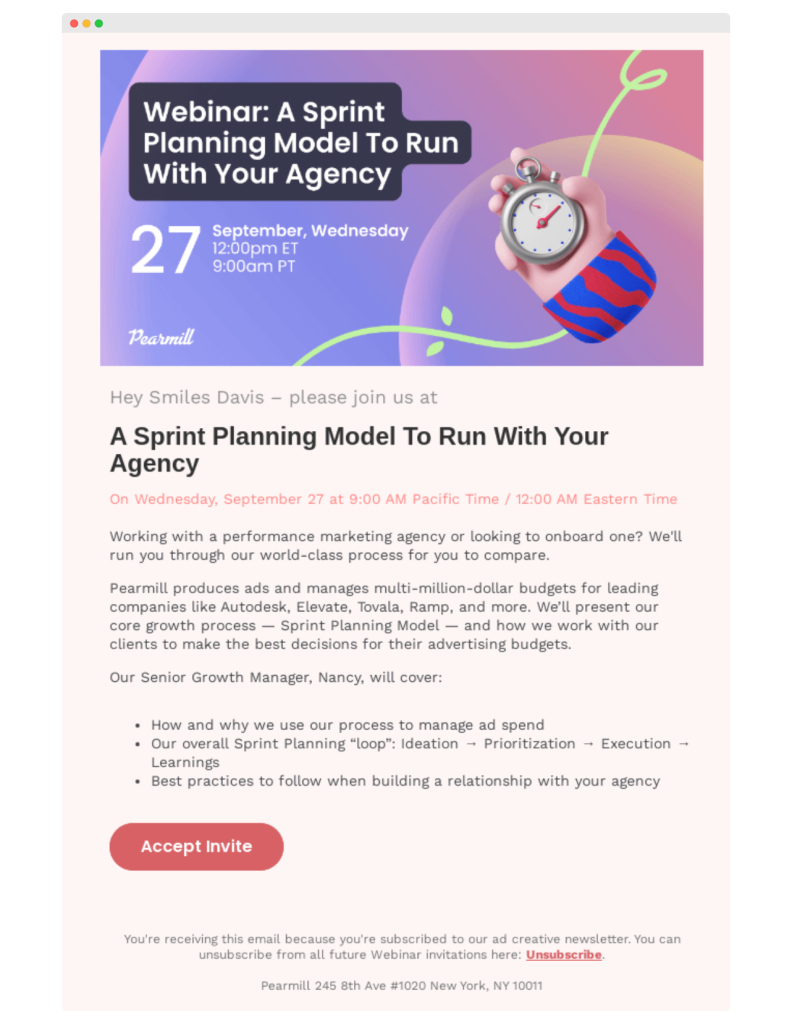
17. “Accept invite”
It may appear that this CTA button isn’t the most powerful one. You may even think it is just a call to action with a primary copy. But the power lies in the word “invite.” It suggests to the email recipients that they have been chosen. They got the invitation, so they should accept it. It’s as if the event is reaching out to them personally.
Content engagement
18. “Get industry insights”
This CTA promises valuable information in return for the reader’s details. It works because it promises access to helpful information. This CTA appears especially well in B2B contexts or industries where staying up-to-date is critical.
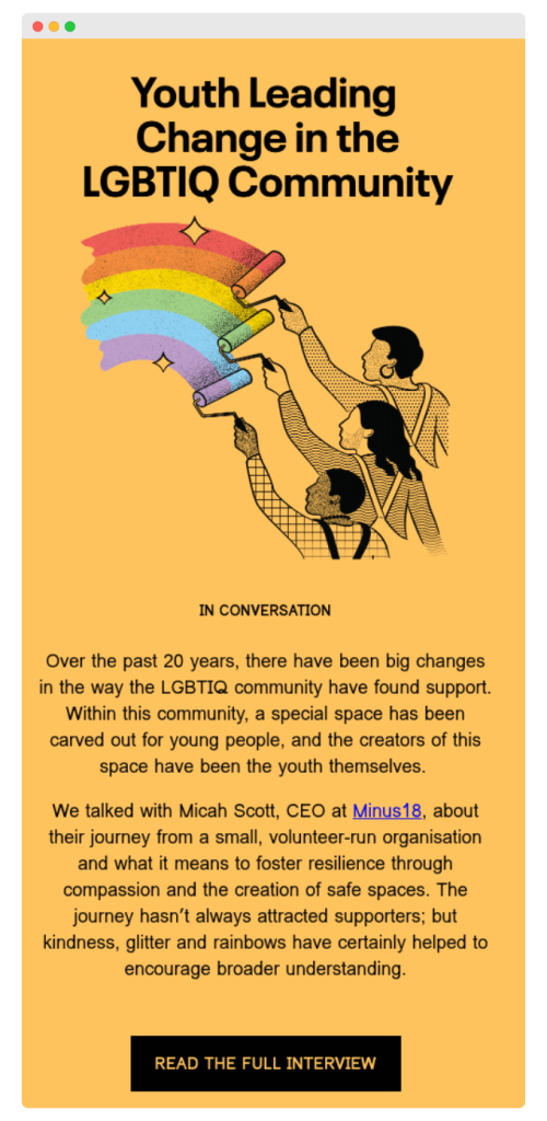
19. “Read the full interview”
If you start CTA buttons with action phrases, you immediately show the reader what they need to do next. You can tease them with a bit of the story, then push them more with a CTA toward the detailed interview. It’s a smooth way to keep them interested.
20. “Peek inside the secrets”
This one’s for the free ebook with juicy details. It’s like offering a key to unlock privileged information. Such call-to-action words work because they appeal to the desire to discover some hidden gems. Receivers can already see the value – exclusive knowledge.
21. “Skill up in a click”
Here’s the deal – the customer gets an ebook that’s a goldmine of know-how. This CTA is like a triple espresso shot for skill-building. It’s saying, “Hey, want to be a champ at something? Just tap here.” Designed for people in a hurry. They’re just a click away to learn something new.
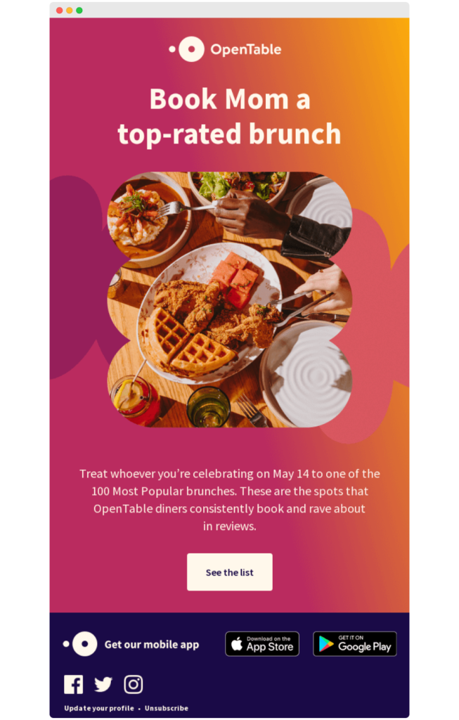
22. “See the list”
A solid call to action in your email should be super straightforward. Imagine it like a friendly signpost in an email, pointing your readers straight to a must-read blog post. Or, like in the example, to the list of the most popular recipes.
23. “Unlock full article”
In an email, this main CTA can be subtle yet powerful calls to action. It invites readers to access more in-depth content, making it ideal for lead generation and increasing the conversion rate. This CTA can work well in tandem with offers like a free account or a free proposal and add depth to your overall online marketing strategy.
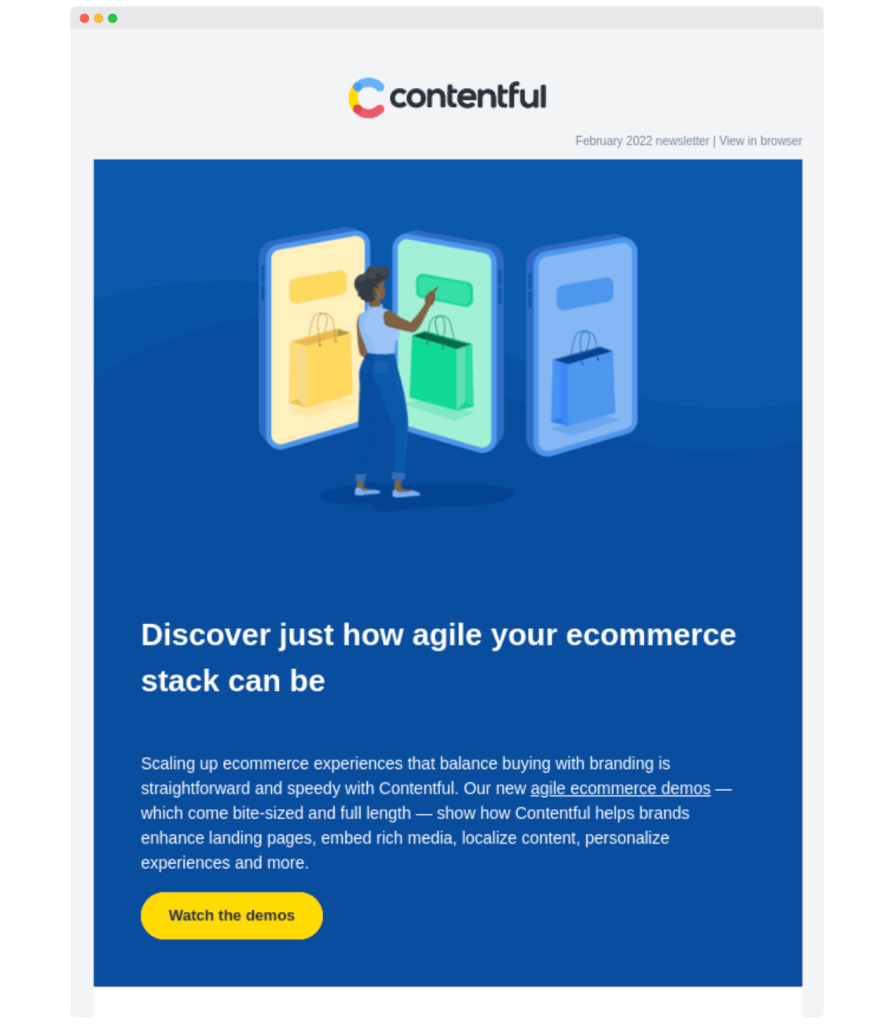
24. “Watch the demos”
Here’s a compelling CTA for email marketing campaigns. It’s a strong call that goes beyond a basic “subscribe today” button. Your ‘Watch the demos’ invitation gives prospective customers a glimpse of your value proposition. And it’s a tactic proven to increase conversions.
25. “Grab your cheat sheet”
This action button uses power words to encourage customers to take immediate action. And in return, it offers something of immediate value (cheat sheet). It can be a secondary CTA complementing a primary call like “start free trial,” addressing the audience’s pain points directly (be careful with using 2 CTAs in one email, though).
Feedback and surveys
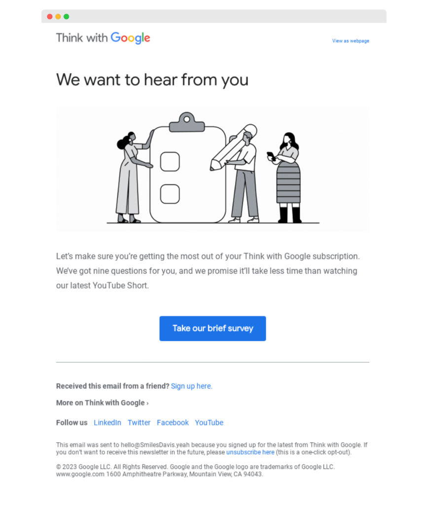
26. “Take our brief survey”
It’s a friendly reminder, not a push. It’s a perfect call when you want feedback but respect your reader’s time. Slip this into an email after a customer uses your service. Pro tip: You can pair it with a visual of a ticking clock to emphasize the “brief” part.
27. “Help us improve”
This one is like asking for a helping hand from a friend. It’s personal and shows vulnerability, which can be a powerful motivator. Use such action buttons when genuinely seeking advice to improve your services, e.g., after a product launch. It turns feedback into a collaborative effort.
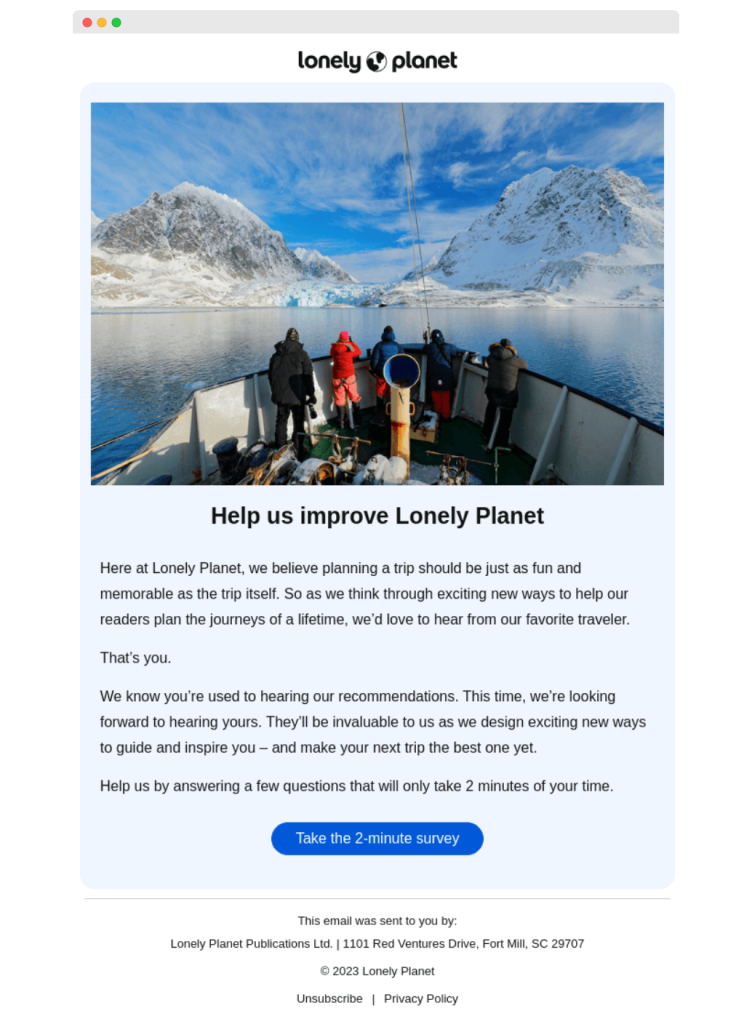
28. “Take the 2-minute survey”
Saying “2-minute survey” sets clear expectations. It’s great for busy customers who want to know how long a particular task takes them. Pop up this into an email after a purchase with a line like in the example: “…will only take 2 minutes of your time”. It’s straightforward and respects the reader’s time.
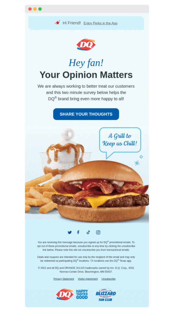
29. “Share your thoughts”
The CTA is similar to a coffee chat. It’s casual and open-ended, perfect for when you want detailed feedback. Use it in a follow-up email a week after a purchase or an event. It’s like saying, “We’ve had our say. Now it’s your turn.” Encourage users to be honest – it’s like gathering insights over a virtual coffee.
30. “Make us better”
Here, the action words are empowerment. It tells your customers, “You have the power to improve us.” Use it when you’re ready for hard truths that can lead to real change. Put it in an email, coupled with a message like, “Your experience can shape our future. Help us evolve.” It’s an invitation to be part of your brand’s journey.
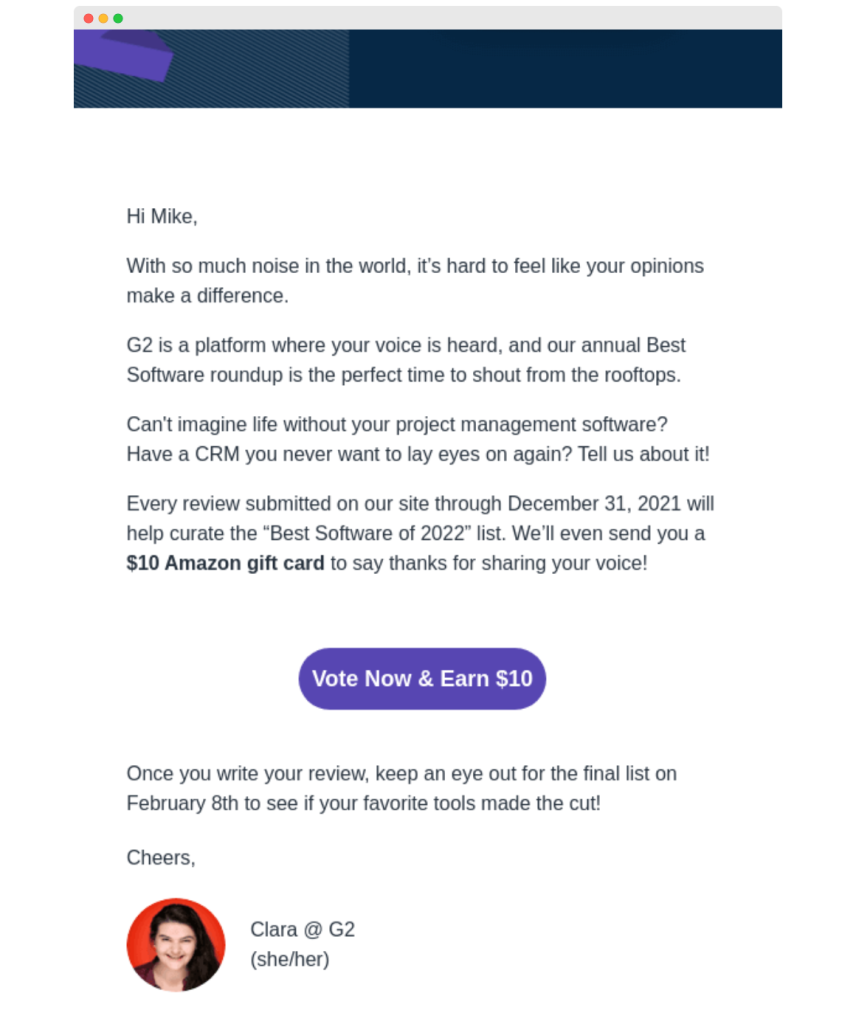
31. “Vote now & earn $10”
Who doesn’t like a little incentive? This CTA combines action with reward. It’s perfect for quick polls or decisions where you want a high response rate. It’s a win-win – your customers get a bonus, and you gain valuable insights.
32. “Tell us what you think”
It’s the digital equivalent of a suggestion box. It’s direct and suggests you’re open to all kinds of feedback. It works well in a post-interaction email. Pair it with a line like, “We’re all ears. Your feedback is our stepping stone to excellence.” Let your audience know that you value detailed feedback and are open to hearing what your audience says.
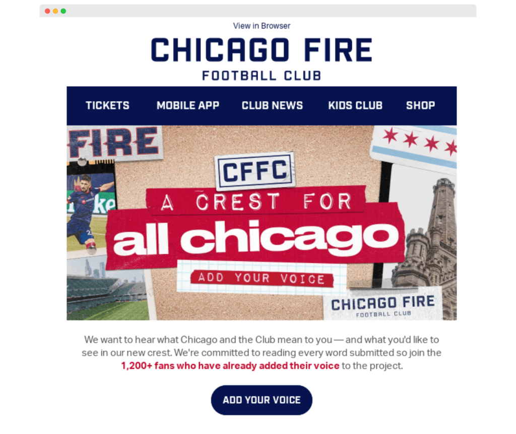
33. “Add your voice”
CTAs like this are meant to make customers feel heard. It’s great for community-driven brands or for gathering opinions on social issues. Use it when you want to show that every individual opinion counts.
34. “Your suggestions matter”
It’s like a warm, reassuring pat on the back. It’s perfect for when you’re looking for constructive feedback. Use it in a scenario where you’re ready to make changes based on what you hear. It shows that you’re not just listening, but also ready to act. It builds trust and shows that you value customers’ input genuinely.
Customer retention and loyalty
35. “Join our community”
This call-to-action example works well for brands that want to build a strong, engaged community around their products. It goes beyond a simple transaction or exchange of information. It suggests becoming part of a group, which can be a powerful motivator.
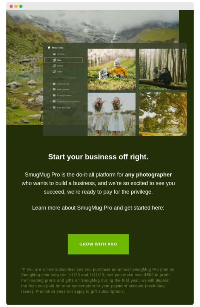
36. “Grow with pro”
“Grow” evokes an emotional response in the respondent. It triggers a simple action: “I want to develop myself, so I must click.” It appeals to the reader’s aspirations. This strong CTA is ideal for educational platforms, professional services, or, like in the example – help-to-grow products.
37. “Experience the difference”
This CTA is like a friendly challenge. It’s perfect when you’ve made some upgrades or changes and want customers to see the improvements firsthand. Include it in an email announcing updates or new features. It’s an invitation to a fresh experience.
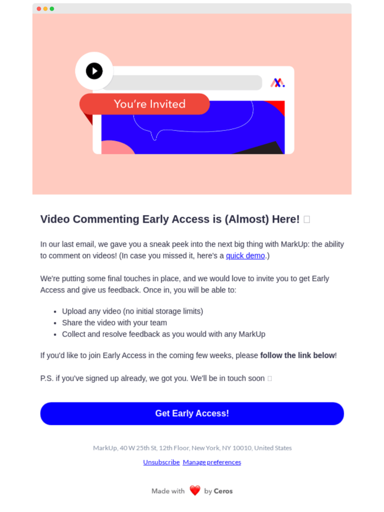
38. “Get early access”
Who doesn’t love being ahead of the crowd? It’s great for a pre-launch email or a sneak peek at a new product. Like in the MarkUp example, include a message about the benefits customers can expect. It’s like giving your customers a VIP backstage pass.
39. “Discover more”
This CTA is like the start of an intriguing story. It’s perfect for leading customers to additional content, such as related blog posts, new product features, or extended services. Use it in an email that teases a little bit of information and then leads them to a landing page with the full story.
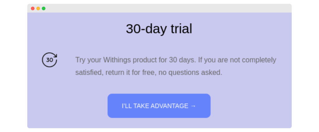
40. “I’ll take advantage”
The CTA is a clever twist on the traditional call to actions. It puts the decision right in your customer’s hands and makes them feel they have control. Making the text in your call to action first-person can be a powerful way to motivate your reader to click.
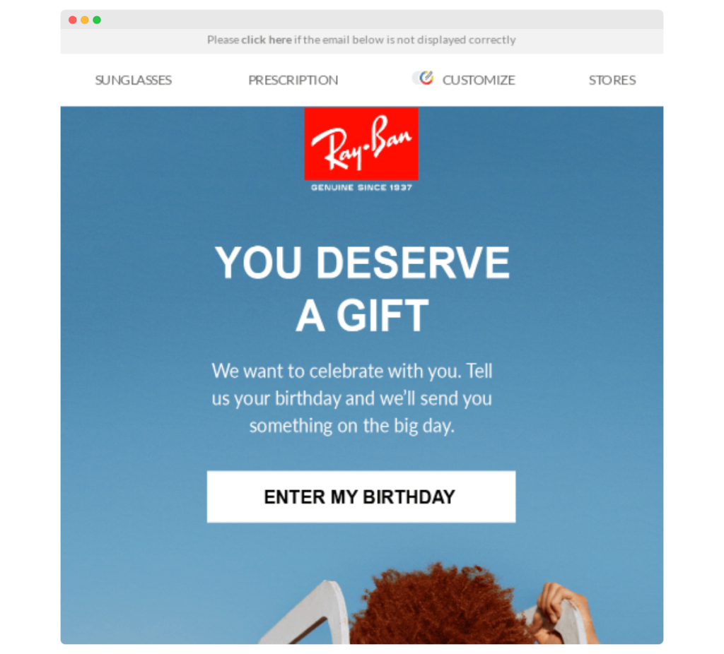
41. “Enter my birthday”
Personal and fun, this CTA is perfect for personalizing the customer experience. Use it in a profile update email with a tone as in the example below: “We want to celebrate with you.” It promises personalized treats or offers and makes the customer feel valued and celebrated.
42. “Stay updated”
This CTA is clear and straightforward. Right away, the reader knows what clicking on it means. It can be used to encourage customers to subscribe to your newsletter, follow your brand on social media, or set up notifications for new content or products.
43. “Redeem gift”
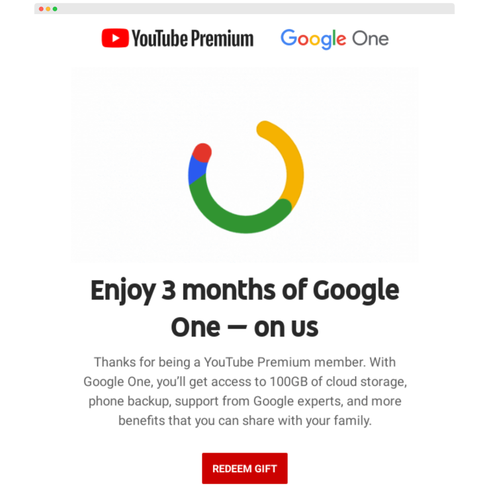
Everyone loves a gift, and this CTA is like handing one over. Use it in an email offering a freebie like print on demand products, a discount, or a special bonus (or 3 free months as Google does). It’s a simple, appealing invitation. And, it adds excitement to the customer experience.
44. “Watch our latest”
For brands with video content, this CTA is ideal. It can direct customers to your latest video, webinar, or tutorial. Videos are a highly engaging medium and can be a powerful tool to keep customers interested and connected with your brand’s story. Make the most of it.
Upselling and cross-selling
45. “Switch to annual”
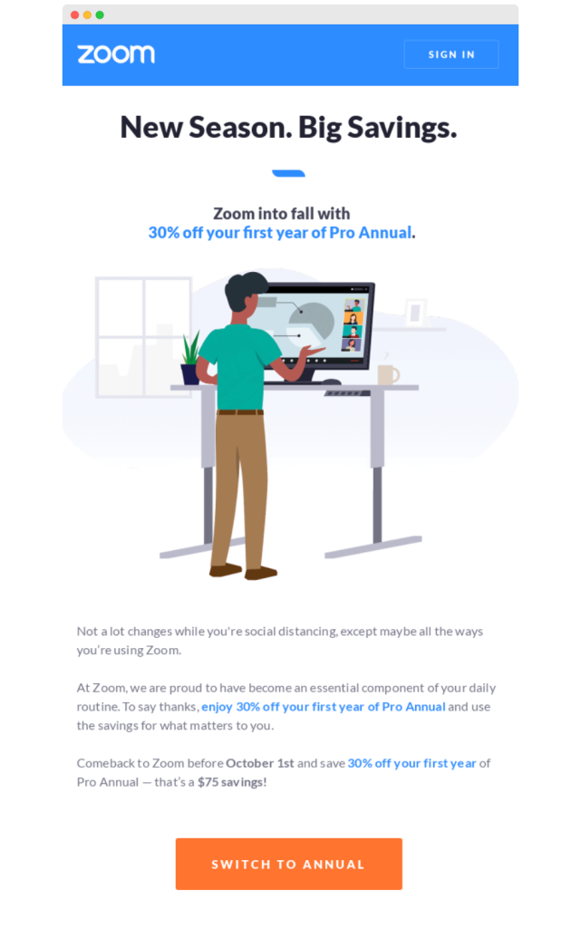
Such calls to action are perfect for suggesting a switch from monthly to annual plans, often with a cost-saving angle. Use it in an email that breaks down the long-term savings. It’s an intelligent push towards a more committed yet beneficial relationship.
46. “Upgrade for more features”
It’s like a tour guide to a better experience. It’s ideal for when you’ve got new features or services. Place it in an email that highlights these new capabilities with a message like, “Ready for an upgrade? More features await!” It’s an invitation to step up to a richer experience with your product.
47. “Get 20% off premium”
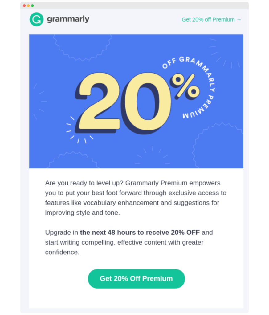
When website visitors land on landing pages, their eyes naturally search for numbers. No wonder money is one of the biggest factors in the decision-making process (Statista). This CTA leverages that power brilliantly. By highlighting a specific discount – in this case, 20% off – this CTA captures attention and sets the stage for action. It’s a clear, quantifiable benefit that speaks directly to the savvy shopper’s desire to score a deal.
48. “Complete your set”
It’s a classic cross-selling CTA. It works for customers who have purchased a product and might be interested in related items. Use it to suggest complementary products. For example, if a customer bought a phone, this could lead them to cases.
49. “Get the deal”
Direct and irresistible – this CTA is like a friend calling to tell you about a great deal. Use it for special promotions or limited-time offers. It’s a call to action that creates urgency, like saying, “Hurry, this deal won’t last. Grab it while you can!”
50. “Upgrade to [product]”
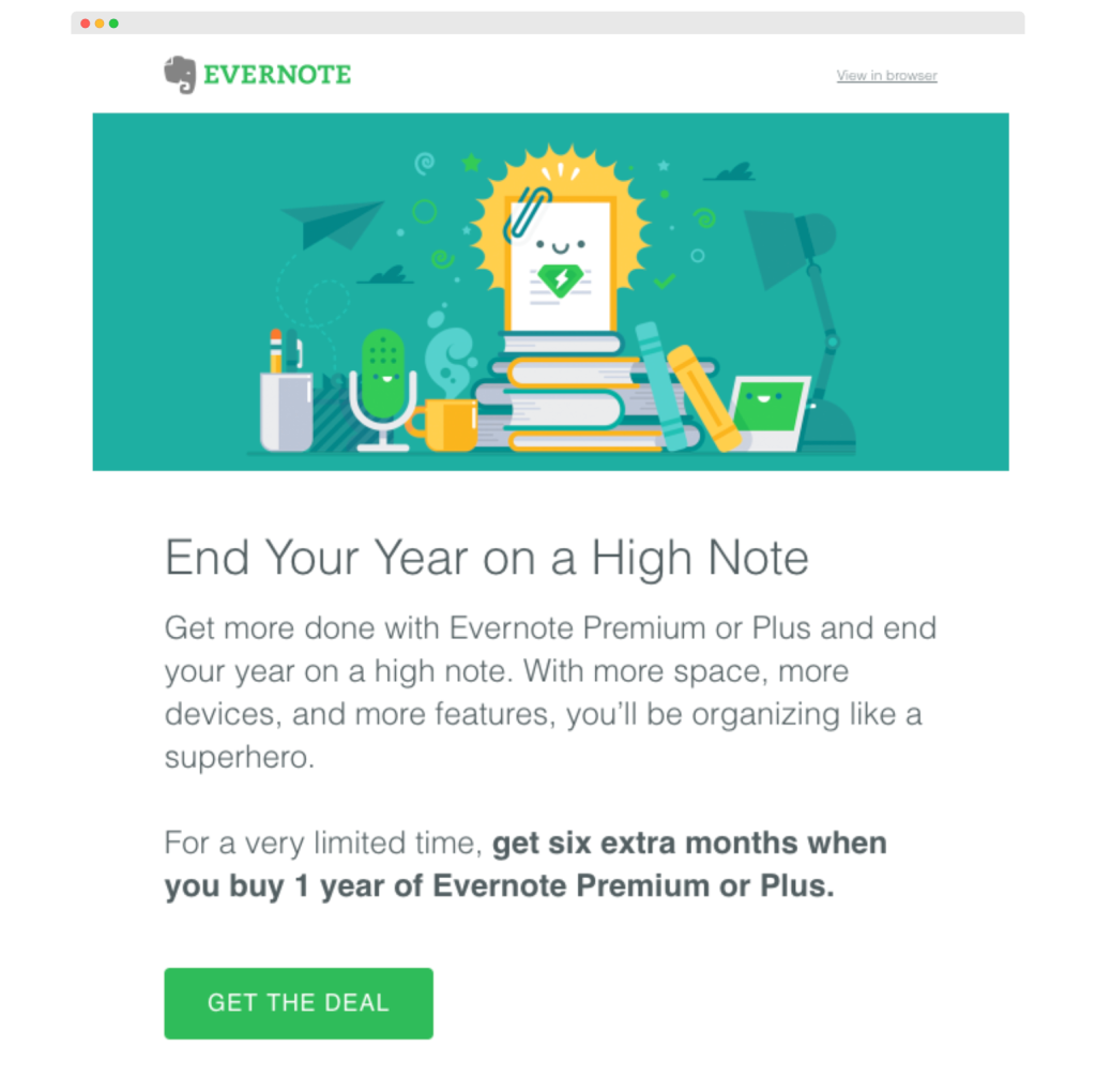
When you have a newer or more advanced version of a product your customers already like, this CTA button is ideal. Use it along with a copy that details the benefits the upgrade offers. Same as in the example.
![“Upgrade to [product]” - CTA example](https://woodpecker.co/blog/app/uploads/2023/12/image9-1024x856.png)
51. “Bundle and save”
Bundling products is an effective cross-selling technique in ecommerce brands. CTAs such as this one offer customers savings when they buy several products together. It’s particularly effective for products that naturally go well together and helps you boost the average cart value (ACV).
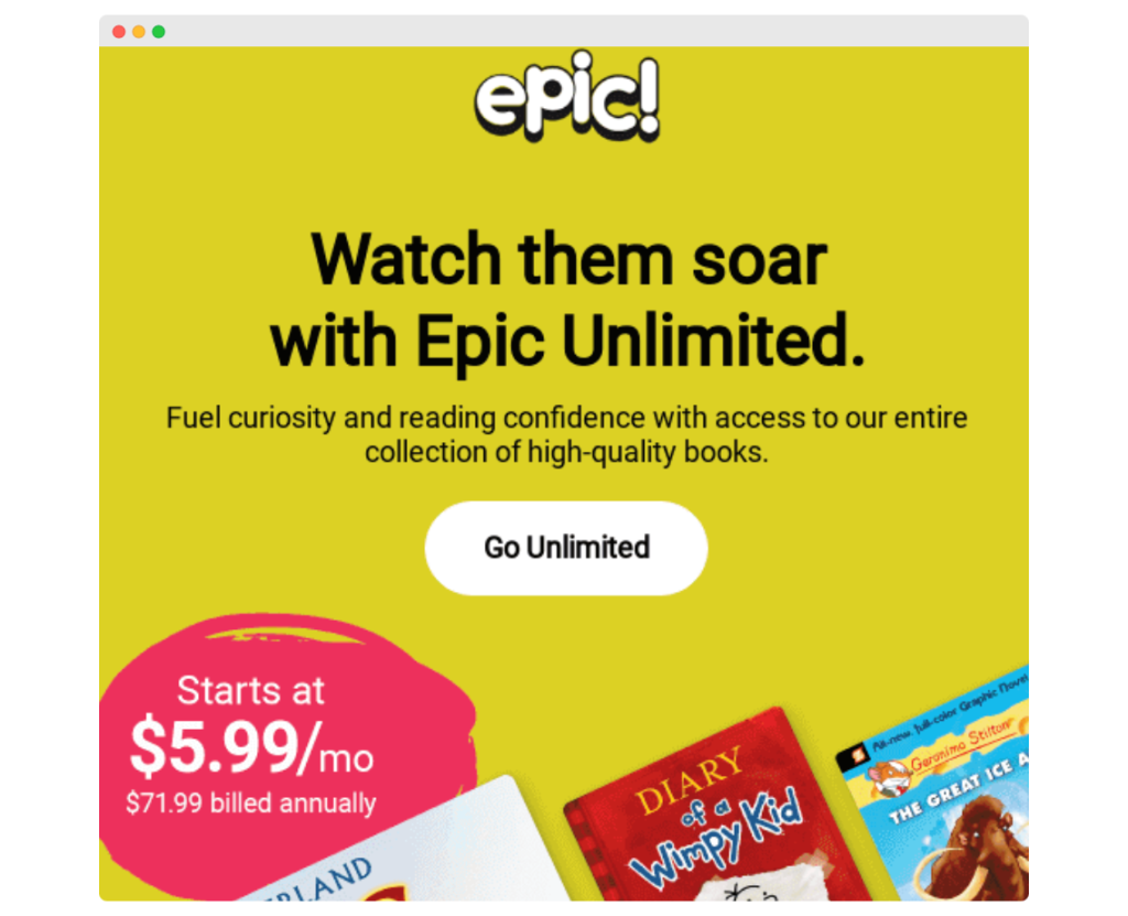
52. “Go unlimited”
With such call to action buttons, the reader feels like they have endless possibilities when they open the email. It works well for services where you can offer an unlimited version, like access to the entire collection of books. Place it in an email that highlights the freedom with a message like, “Why limit yourself?” It’s an attractive offer for those who don’t want to be held back.
From click to a customer
These CTA examples show that the right call to action is short, personalized, and doesn’t leave the reader in the dark.
Now, it’s your turn to implement compelling CTA in your own email campaigns. Watch your audience engage and respond to your buttons exactly in the way you want them to.
FAQ
What is a catchy CTA?
A catchy CTA (call to action) is a straightforward call to action that clearly prompts the target audience to take a specific, desired step in the conversion process.
What is an example of a CTA event?
A CTA event could be a webinar registration button on landing pages, designed to drive lead generation through compelling call to action examples.
How to write a CTA?
To write an effective CTA, focus on using action-oriented CTA words that motivate immediate response, typically displayed on cta buttons.
What are CTA words?
CTA words are powerful, direct phrases used in a call to action example to inspire and engage users, encouraging them to act promptly.
